Who’s Old Enough to Know What a Cracker Barrel Is? Nostalgia vs. Necessity in Branding

If you’ve ever worked in marketing or creative services, you already know the drill: everyone thinks they can do your job. Everyone has an opinion on a logo. Everyone becomes a designer or a brand strategist in the court of public opinion. The Cracker Barrel rebrand is just the latest example. A company makes a design change, and suddenly, X, Threads, and Aunt Mary on Facebook are all creative directors.
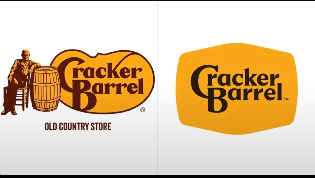
This time, the outrage came because Cracker Barrel retired its old logo—the one with the man leaning against a barrel—and went minimalist. Cue the cries of “soulless” and “woke.” But let’s get real: none of us were in the room for the strategy brief, the research, the customer insights, or the twenty rounds of revisions that led to this moment. That’s what makes brand transformations so fascinating—you only see the output, not the months (or years) of work behind it.
And this, honestly, is my favorite part of working in marketing. At Ann Taylor and LOFT, at Macy’s, at the Specialty Food Association—I’ve been lucky to join teams right when brands were at the rumblings of big change. There’s nothing like being in the middle of a design evolution: the debates, the data, the culture shifts, the creative tension. It’s messy and electric and, when done right, transformative.
The History & The Weight of Nostalgia
Now, about Cracker Barrel specifically. Let’s pause for a minute: does anyone even know what a “cracker barrel” actually is anymore? I barely do. Historically, they were literally barrels of soda crackers in old country stores where men would gather to gossip and debate. Quaint, sure. But let’s not forget that those same country stores, in the Jim Crow South, were not always “welcoming” to everyone. My parents went to segregated schools. Black people could be allowed to spend money, but not without facing discrimination and humiliation. So does it bother me that the logo changed? Absolutely not.
The company says the new design is about being more inclusive, reflecting the diversity of today’s guests. For me, that’s not “woke”—that’s just good business.
The Real Reason for Change: Declining Sales
Here’s the truth the angry folks don’t want to hear: the logo change wasn’t the cause of Cracker Barrel’s slump—it was a response to it. The brand had been losing relevance for years.
Sales were flat, and net income was cut in half in 2024.
Stock price peaked at $180 back in 2018 but has been sliding since.
Customer traffic is down. Retail sales are down. Market share is down.
Younger diners weren’t showing up, period.
The brand’s reliance on nostalgia—kitschy décor, cluttered stores, outdated recipes—wasn’t pulling in new customers. So Cracker Barrel did what any smart brand should do: evolve.

The Strategy Behind the Rebrand
This isn’t just about a logo. It’s a holistic shift:
Restaurant remodels: Moving from dark wood and wall-to-wall tchotchkes to lighter, brighter “modern farmhouse” vibes.
Menu upgrades: Testing craveable new items and revising pricing strategies.
Customer experience: Loyalty programs, digital waitlists, online ordering.
Visual identity: Simplifying the logo for digital platforms, refreshing colors, and keeping some heritage cues.
The design team didn’t just wake up one day and decide to erase Grandpa from the logo. They worked from a clear brief: modernize, broaden appeal, keep the essence. The “barrel” is still there—just abstracted, more versatile, easier to read on a phone screen. The colors? Inspired by biscuits and scrambled eggs. (Tell me that isn’t genius branding.)
Why the Backlash Misses the Point
Look, I’m not blown away by the standalone logo either. But logos don’t live in isolation. When you see it in context—on menus, signage, packaging, social—it works. It feels fresher, more scalable, and still recognizable.
What most people don’t understand is that logos aren’t designed for nostalgia. They’re designed for function, for application, for longevity. And in today’s digital-first world, the old Cracker Barrel logo should’ve retired years ago.
The backlash? It’s predictable. Loyalists cling to what’s familiar. Employees can resist change. Social media loves to scream “sellout.” But here’s what I know from experience: the real impact of a rebrand isn’t felt in the first week of social media takes. It’s seen in the sales lift, the customer engagement, the market share shifts that happen months—or years—later.

What Cracker Barrel Wants to Be
At its core, Cracker Barrel still wants to offer comfort, community, and country hospitality. The rocking chairs aren’t going anywhere. The fireplaces are still lit. The peg game is still on the table. But they’re also saying:
We want to welcome new generations.
We want to show up on new platforms.
We want to be lighter, brighter, more inclusive, and still authentically “us.”
That’s the balance every brand has to strike: honoring heritage without being handcuffed by it.
My Take
Unpopular opinion: I like the rebrand. Not love at first sight—but respect. The logo alone doesn’t wow me, but the total package? I really like it. It works. It’s a smart, strategic move rooted in data, not just design.
Because here’s the thing: what worked 50 years ago doesn’t work today. Brands that don’t evolve don’t survive. Period. And for Cracker Barrel, this isn’t just about biscuits and gravy. It’s about relevance, inclusivity, and setting the table for the next 50 years.
So before we all pile on, let’s give it a minute. Branding is a long game.